
Image and text blocks
These blocks are the most common, and quite straight forward.
TipTap editor
The TipTap editor block provides a flexible rich text editing experience for structured content. It supports common formatting options such as headings, links, lists, images, and inline content while keeping the output clean and predictable. This block is useful for text-heavy sections where editors need freedom without sacrificing consistency, performance, or frontend control.

Teaser Block
The teaser text block is used for longer content where only the beginning should be shown by default. It keeps the page clean by displaying a short preview, with a “Read more” option that expands the full text when needed. This is useful for introductions, descriptions, FAQs, or content sections where editors want to avoid overwhelming visitors with too much text at once.
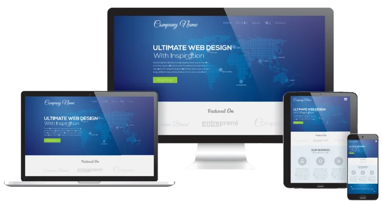
Image Block
The image block displays a single image as part of the page content. It is useful for adding photos, illustrations, or visual context between text sections. Optional settings such as alt text, captions, alignment, and sizing help keep the image accessible, responsive, and consistent with the overall design.
Cards
A flexible vertical card with space for an image, heading, body text, and a call-to-action button.
The entire card can also be used as a link, making it ideal for teasers, featured content, or navigation blocks.
For longer text, an optional “View more” feature keeps the layout clean without hiding useful content.

Vertical card
A flexible vertical card with space for an image, heading, body text, and a call-to-action button. The entire card can also be used as a link, making it ideal for teasers, featured content, or navigation blocks. For longer text, an optional “View more” feature keeps the layout clean without hiding useful content.

Horizontal card
A flexible vertical card with space for an image, heading, body text, and a call-to-action button.
The entire card can also be used as a link, making it ideal for teasers, featured content, or navigation blocks.
For longer text, an optional “View more” feature keeps the layout clean without hiding useful content.
Presentation
Because not every piece of content deserves to be emotionally available at all times.
Absolutely. Especially for questions people ask because they refused to read the previous paragraph.
The accordion expands, the layout survives, and somewhere a frontend developer briefly feels peace.

Yes, you can put whatever you like in here..
-

Even this
Example image
-

A slider inside an accordion
I'm just praying you will not actually use it... but you can.
Accordion block
An accordion block is useful for presenting structured content in a compact and easy-to-scan format. Each item can be expanded or collapsed, making it ideal for FAQs, feature lists, technical details, or longer supporting information. It helps keep the page clean while still giving visitors access to deeper content when they need it.
Customer box
A customer box block is used to highlight a client, partner, or featured company with a clean visual presentation. It typically includes an image or logo together with a call-to-action linking to the client’s website. It is ideal for customer showcases, partner sections, references, or any area where external credibility needs to look slightly more intentional than “here are some logos, enjoy”.
Hero style divider block
A hero style divider block is used to create a strong visual break between sections of a page. It combines a background image with a title, supporting text, and an optional call-to-action, giving the section the feel of a smaller hero area. It is ideal for highlighting important messages, guiding visitors to key pages, or adding visual impact without needing a full page hero.
Image in the middle block
The image in the middle block combines a central visual with structured supporting content around it. It is useful for presenting key features, process steps, or grouped information where the image provides focus and the surrounding text adds clarity.
Highlight key features
Use the central image as the visual focus, with surrounding text explaining individual features, benefits, or selling points.
Explain a process
Show a product, service, or concept in the middle, then use the surrounding items to describe steps, stages, or related actions.

Present benefits clearly
Place the main visual at the center and surround it with short benefit-led messages that are easy to scan and understand.
Break up content-heavy pages
Use the block to add visual structure to longer pages, making important information feel lighter, more balanced, and less like a punishment.

Person Block
The person block provides a flexible way to present team members, contacts, authors, or other people across the site. Each person is stored in a central repository and can be reused wherever needed, while display settings allow editors to control which details appear in each specific context.
-
Slide one
-
Slide two
-

Slide three
Slider block
The slider block supports both simple and advanced slide layouts, from basic image-and-text presentations to fully structured grid components. It gives editors a flexible way to showcase featured content, campaigns, products, or key messages. Since slides can contain rich block content, it is highly adaptable, though best used with restraint unless the goal is to turn the page into a tiny haunted theme park.
-
Slide one
-
Slide two
-
Slide three

Example title one
Proin quis felis dui. Suspendisse sit amet quam id urna euismod sagittis. Aenean eget tortor est. Morbi vitae varius orci. Nullam et tortor sem. Aenean euismod urna id aliquet vehicula. Nam ultrices ipsum felis, eget feugiat metus euismod ut. Nam non velit placerat, commodo ligula eu, finibus mauris.

Example title two
Pellentesque ac tortor leo. In quis nisl blandit, interdum ligula quis, finibus dui. Nulla finibus malesuada accumsan. Pellentesque viverra, turpis vitae congue egestas, erat ante euismod odio, et interdum eros arcu sit amet nisi. Vestibulum ante ipsum primis in faucibus orci luctus et ultrices posuere cubilia curae.
Lists
The list block provides a simple way to present repeated content without relying on API-driven data. Editors can manually add list items with images, titles, and body text, making it ideal for curated lists, feature overviews, service highlights, or structured page content that needs consistency without extra complexity.
Animated number block
The animated number block helps bring key statistics and metrics to life. Editors can define a target value, such as 65 out of 100, and the number will count up from 0 when displayed. It works well for performance indicators, achievements, progress values, ratings, and other important figures.
Skillbar block
The skillbar block provides a simple way to visualise skills, strengths, or progress levels. With animated bars and values from 0 to 100, it helps turn capability lists into something easier to scan, compare, and understand.
Example contact form
Simple static contact form that is built stand-alone. For more advanced form capabilities, I would recommend getting Umbraco Forms.